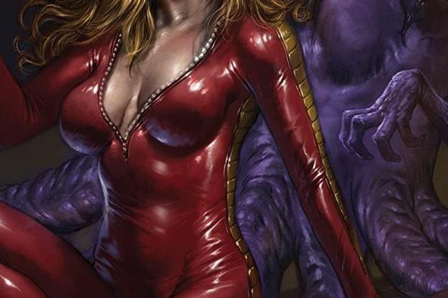
Barbarella (2021) #1 - Review
Writer: Sarah Hoyt
Artist: Madibek Musabekov
Colorist: Ivan Nunes
Letterer: Carlos M. Mangual
Published by: Dynamite
Barbarella is back at Dynamite for another go-around with a new creative at the helm. This time, Sarah Hoyt and Madibek Musabekov take the reins and provide an entertaining first issue that holds a lot of promise.
This time around, Barbarella gets asked to help out a freedom-fighting group on Earth called the Brotherhood of Tortuga (a nice little nod to the pirate sanctuary of the Caribbean) as they are fighting the Eternal Empire. The goal of bringing in Barbarella is to prevent any further bloodshed as she tends to, well, win over the hearts of men and women.
As a premise, Hoyt digs into the idea that Barbarella’s magnetism is at a legendary status and plays around with this notion throughout the issue. You see this in both the artwork, Musabekov depicts Barbarella’s arrival and departure from the Brotherhood’s base as somewhat of a lovefest, and Hoyt’s depiction of Barbarell’s arrival to the planet she is to infiltrate Camelot - a reversal of the first scene, are both great examples. It’s a good way of both showing and telling the reader of one of Barbarella’s traits.
The rest of the issue also sees the return of Vix, an animal friend that Barberalla had befriended in the previous Dynamite series, as well as the introduction of an A.I. named Taln, quite literally angelic in appearance, as a somewhat supporting cast. Taln is interesting for those who may have seen the movie from the ’60s as he bears a resemblance to Barbarella’s companion from said movie. The purpose of Taln appears to be, for the moment, to be a love interest for Barbarella but also acting as a stand-in for the reader - asking Barbarella questions and giving some needed exposition.
The art team of Musabekov and Nunes provide a very clean presentation throughout the issue. I’m always one to notice when an artist will make good use of panelling throughout a comic and Musabekov does just that - there are no two pages alike and the use of both wide shots and close-ups keeps the art interesting. I also noticed that he also doesn’t always “respect” the panels, often having characters bleed into other panels. However, the use of the bleed isn’t distracting and helps at times - whether it be showcasing Barbarella standing next to a seated character, or Taln’s wings drawing the reader’s eye in a forward motion.
My favourite part of the issue is the colours by Nunes . As pretty as Musabekov’s pencils are, Nunes’ colouring helps bring to life Barbarella off of the page. The best part of Nunes’ colours is his brilliant use of lighting throughout. A comic that has good use of lighting, will always be well received by me.


