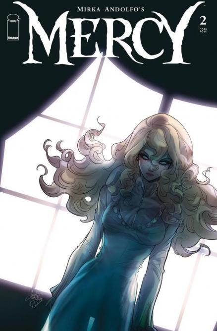
Mirka Andolfo's Mercy #2 Review
Writer: Mirka Andolfo
Artist: Mirka Andolfo
Colours: Mirka Andolfo
Colour Assistant: Gianluca Papi
Letters: Fabio Amelia
A lot was happening in the first issue of Mercy, from the insanely talented Mirka Andolfo, who not only wrote but drew and coloured the entire series, with assistance from Gianluca Papi on colours. The first issue felt like we were only touching on the surface of so many different events and characters, and while the reader could only follow the story in broad strokes, it made for an entertaining read filled with mysteries to draw the reader back again. Just as we feel like we’re beginning to get a handle on what’s going on Andolfo likes to introduce some new element to the plot to show us there’s still so much more to discover.
This second issue begins to fill some of the gaps in but doesn’t seem in any particular hurry to explain things to the reader. It’s quite refreshing to have a comic with a focus on telling the story rather than spending time getting the reader up to date on what’s going on. With a lot of mysteries still waiting to unfold the reader is left blindly following on, trusting that in time the unexplained will become clear.
Lady Hellaine makes for quite an enigmatic lead, she is probably the biggest mystery of the story. Hero or monster? Good or evil? Something in between? While the answers aren’t particularly forthcoming Andolfo is taking painstaking steps to portray her in a certain way, where some stories would have her as a clear cut monster Andolfo lets us know that perhaps there is more to her than meets the eye.
Andolfo’s art is one of the biggest draws of the comic, it’s stunning. When things take a turn for the more supernatural there is a unique otherworldly beauty to the horror which separates it from the standard horror fare. One of the biggest advantages of having a comic which is both written and illustrated by the same person is that the vision that Andolfo has of the story is the exact way it is brought to life, it can be told in exactly as it should. The best comics have a great creative team, a writer, artist, and colourist who are all on the same page and bring out the best in each other.
Then there are the colours. Good colours can help set the tone of a comic just as effectively, sometimes more depending on the context, than the writing or the art. Continuing on the theme that the best comics have a creative team who are all firing on the same cylinder and of the same quality having Andolfo do the colours in addition to everything else just means that everything comes together in a way that is incredibly effective and tells the story exactly how it’s meant to be told.
While it doesn’t feel like any of the mysteries are any closer to being solved than they were after the first issue it’s an entertaining read which keeps the reader intrigued enough to want to return to further explore Lady Hellaine and the town of Woodsburgh. The overall effect is an intriguing otherworldly gothic tale that sucks the reader deep into the story. The art is fantastic and some of the creations contained within are sure to stick in the readers' memories long after they have put the issue down.
A Look Inside


