Friday #1 Review

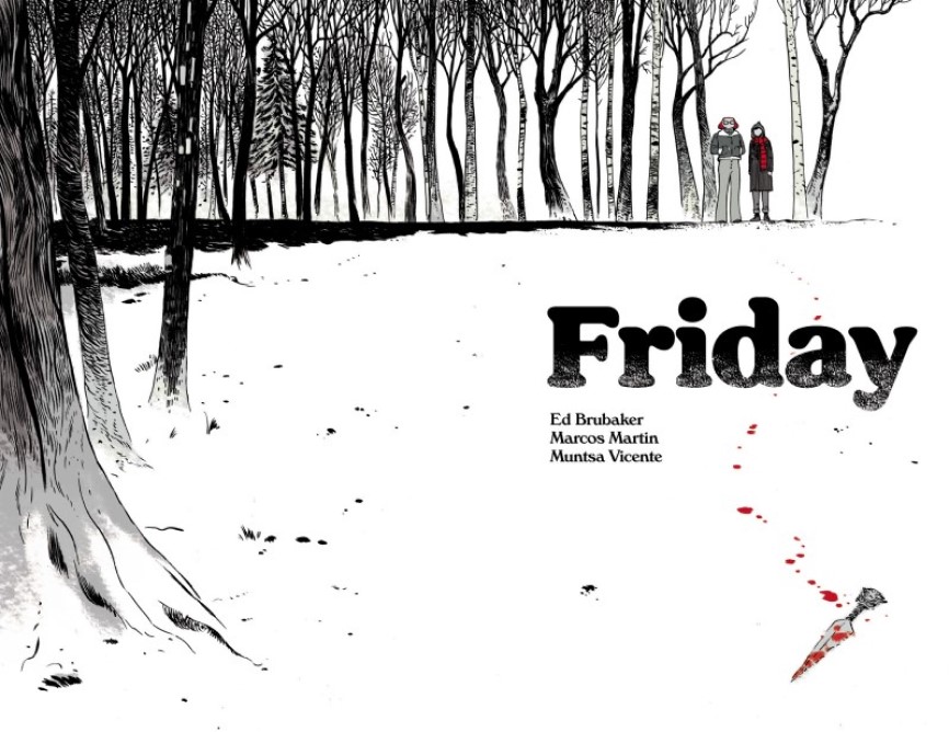
Writer: Ed Brubaker
Artist: Marcos Martin
Colours: Muntsa Vicente
Friday #1 is the first issue of a series focusing on Friday Fitzhugh who, along with her childhood friend Lancelot Jones, used to be a mystery solving duo that wouldn’t be out of place in an Enid Blyton story. But she has now grown up, moved away to college, and has only returned to King’s Hill for Christmas. She’s immediately thrust into another mystery with Lance and finds herself, almost unwillingly, pulled along for the ride.
Ed Brubaker describes this story as a Post-Young Adult Novel, which he points out is not just an Adult novel. It’s a clever idea to revisit a young adult story once the characters have begun to grow up. It works well and there’s still a big part of the story and Friday’s history with Lance still to be revealed. In part it reads a little like a coming of age story.
There is a lot of potential in setting up a world like this. In the future we could return to some of their earlier adventures, perhaps as entertaining one shots, to see the mystery solving duo in practice. For now it’s interesting to see how Friday deals with her changed relationship with Lance, as she’s growing up and moving on with her life but he’s refusing to change.
This comic has been released through Panel Syndicate. A couple of quick notes then, first off it’s a pay what you want comic, so how much it costs is entirely up to you. You’re then treated to a DRM free copy of the comic. The other thing of note is that the layout is landscape rather than the typical portrait of comics. As a digital only release whether or not it works for you is down to personal preference.
Marcos Martin’s art is incredibly detailed, the opening pages centre on the snowy woods at night, where most of the debut issue is set. It’s an atmospheric setting and pulls you right into the story. The character designs are done in homage to the young adult tales that Brubaker would have read when he was younger. Friday in particular has a unique and deliberate look to her. It won’t appeal to all readers unfortunately, which is a shame since the rest of the art is incredible.
Munsta Vicente’s colours do an incredible job in this comic. In particular all the lights are really well done, whether that’s torchlight in the woods, or even just lamp posts, they are incredibly effective. And since most of this comic is set in the woods at night Vicente had a real challenge to make the colours work well. But she does this with ease and creates some of the most stand out colours I’ve read in a comic in a while. Then the scenes which aren’t set at night contrast nicely with the darker scenes. It’s skillfully done.
Brubakers story and characters are intriguing, the whole post young adult premise is exciting, and there is plenty of mystery to hook the reader into the story. The art is incredibly rich and detailed, and the colours in particular really stand out. The style of the art, more specifically the characters, won’t appeal to everyone, which is a shame since this is an excellent debut issue with plenty of promise for future issues.
A Look Inside