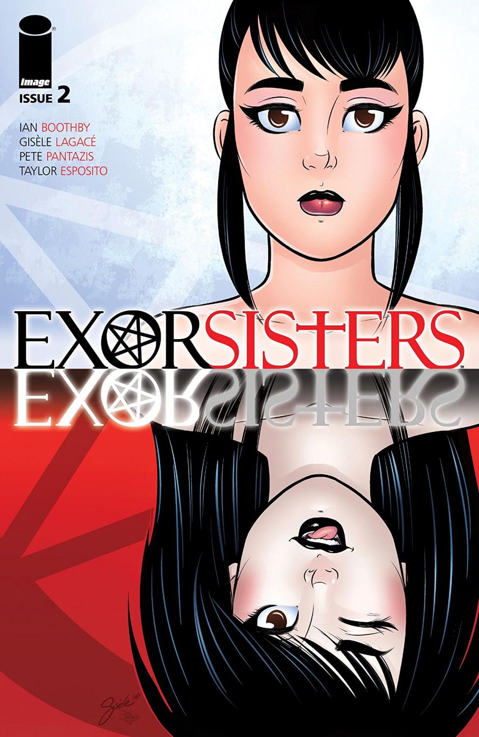
Exorsisters #2 Review
Writer: Ian Boothby
Artist: Gisèle Lagacé
Colorist: Pete Pantazis
Letterer: Taylor Esposito
Publisher: Image Comics
There is just something about Exorsisters that keeps me glued to it’s pages the entire time I read it. Ian Boothby’s characters are fantastically written and the story is getting more interesting than I even expected. There is so much to love in this series, especially if you are already a fan of horror when it is mixed with drama and comedy.
After enjoying the kind of Buffy-styled structure of the first issue, Exorsisters #2 surprised me with an introduction to a deep and dark storyline. I always enjoy comic book series that follow that Scooby-Doo structure of a team solving mysteries and making everything okay by the end of the issue, to then start all over the next issue. I don’t even mind that it seems repetitive because for me personally, it is just a fun style of storytelling.
The first issue of Exorsisters seemed like the series was going to go in this direction and I really liked it. It helped that I adored the main characters, the premise of their job, the creativity of the writer and artist, and the constant humor. I loved every little detail about the issue that the entire series could have been that way and I would have followed along enthusiastically. But Boothby unveiled a complicated, dark, and dramatic story in this second issue that appears to be the start of something really amazing. He has written a storyline with a sleek style of storytelling that keeps your attention and makes you anticipate what is going to happen next.
Equally as important in my obsession of this series is the artwork, colors, and lettering by Gisèle Lagacé, Pete Pantazis, and Taylor Esposito. Every page of this second issue is visually appealing due to each of these aspects.
Lagacé’s illustrations allow us to not only see fear and emotion in the characters, but also allows us to feel it with them. She also beautifully reveals her creativity by illustrating some very unique and sometimes strange characters and scenarios that definitely make me more interested in the story. The evil characters that she’s dawn so far have been so enjoyable because they look so wicked and unpleasant.
This issue also has a lot of flashbacks as the sisters’ mom explains her actions that led to Kate’s existence. This story is written amazingly, and with Pete Pantazis’ colors, the story is hard to look away from. Pantazis adds shades of distinct colors to certain panels throughout the flashbacks that add a sense of drama and horror to those scenes. His color work on the entire issue is great, but I found myself appreciating those reds and blues of the flashbacks a lot while first reading them.
This second issue of Exorsisters adds a layer of drama that I wasn’t expecting after reading and loving the first issue. Boothby had me interested with the more basic storyline that we got from the first issue, but now he has me absolutely enthralled with the story that is about to unfold.
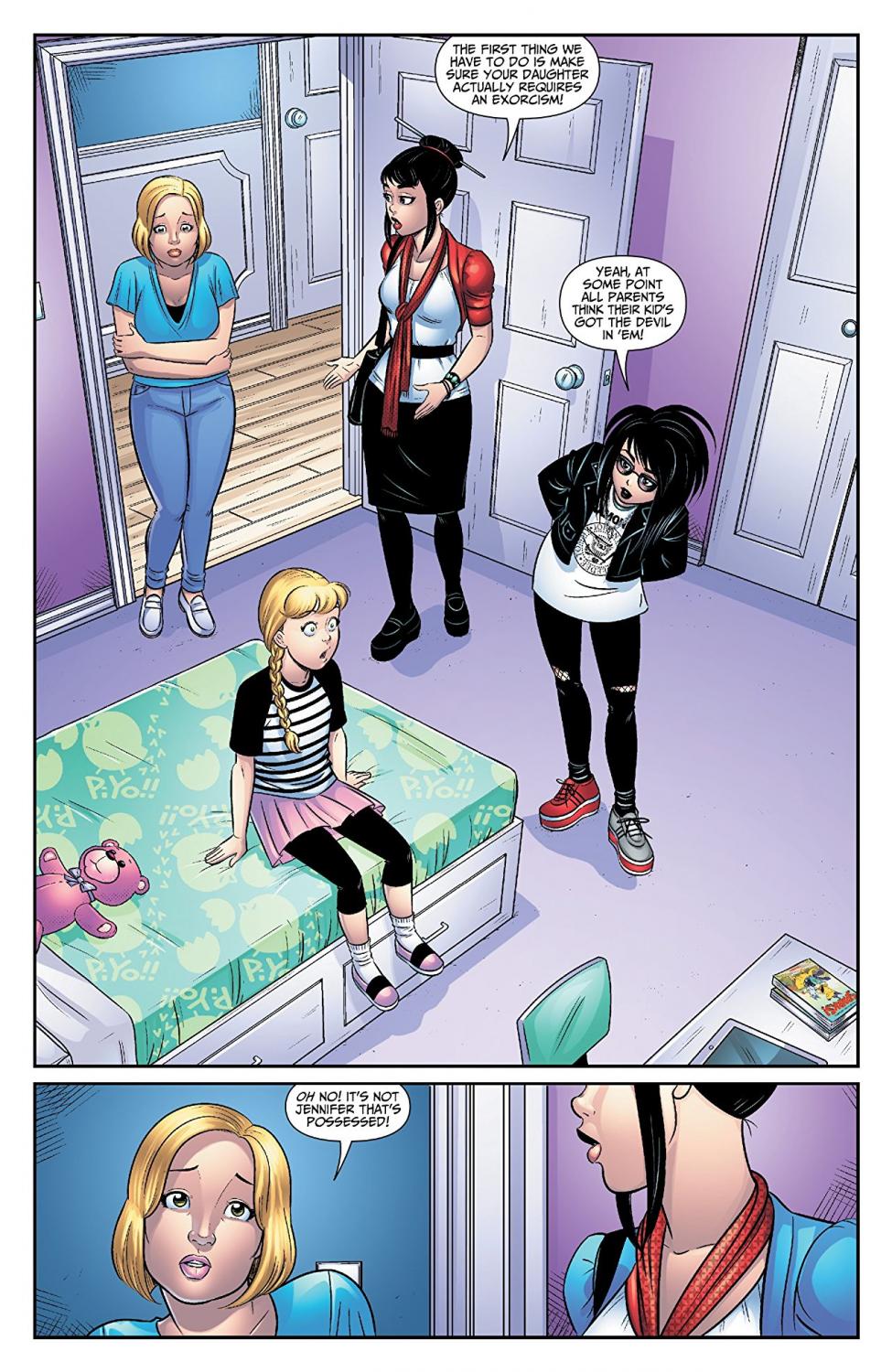
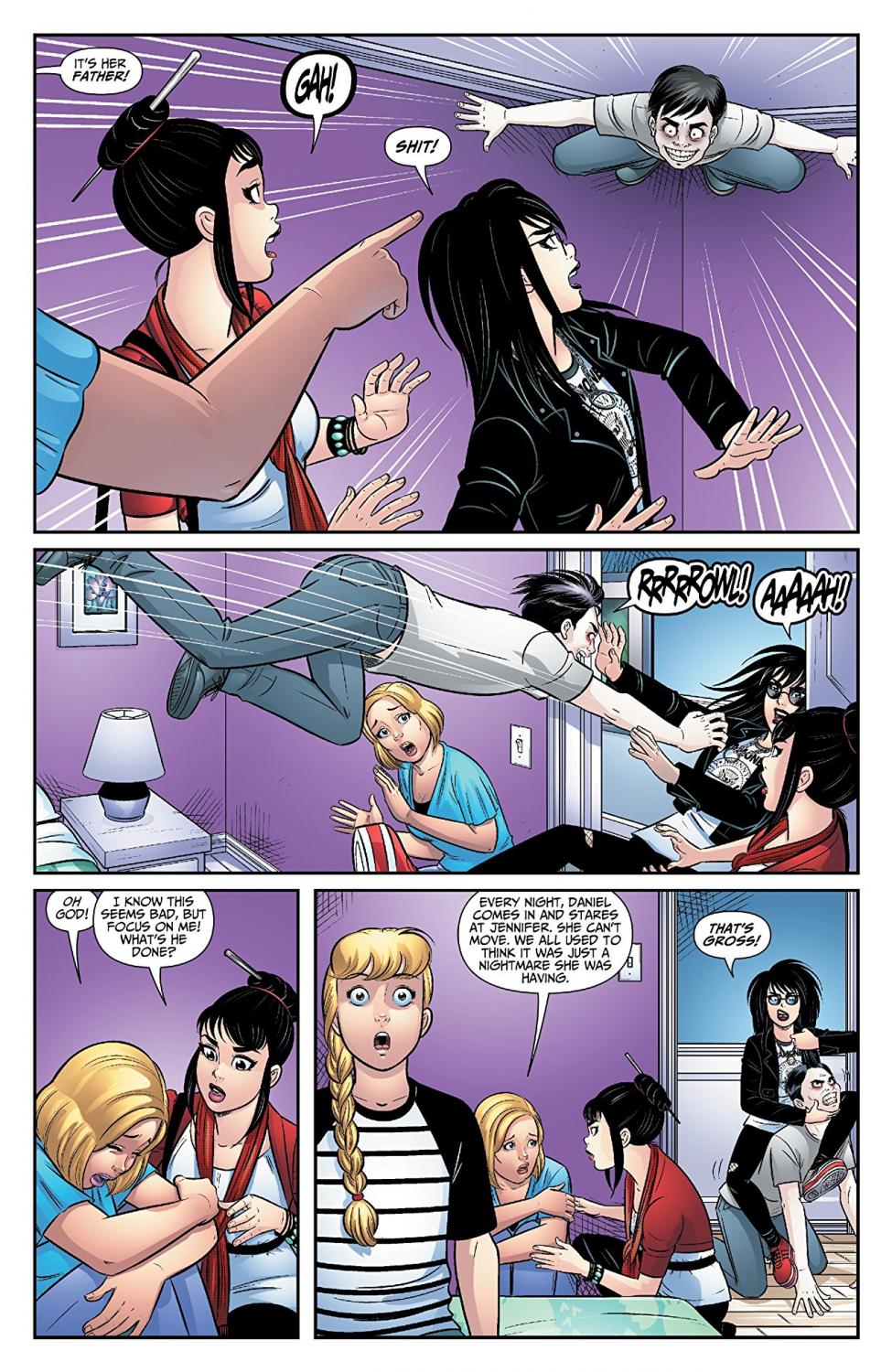
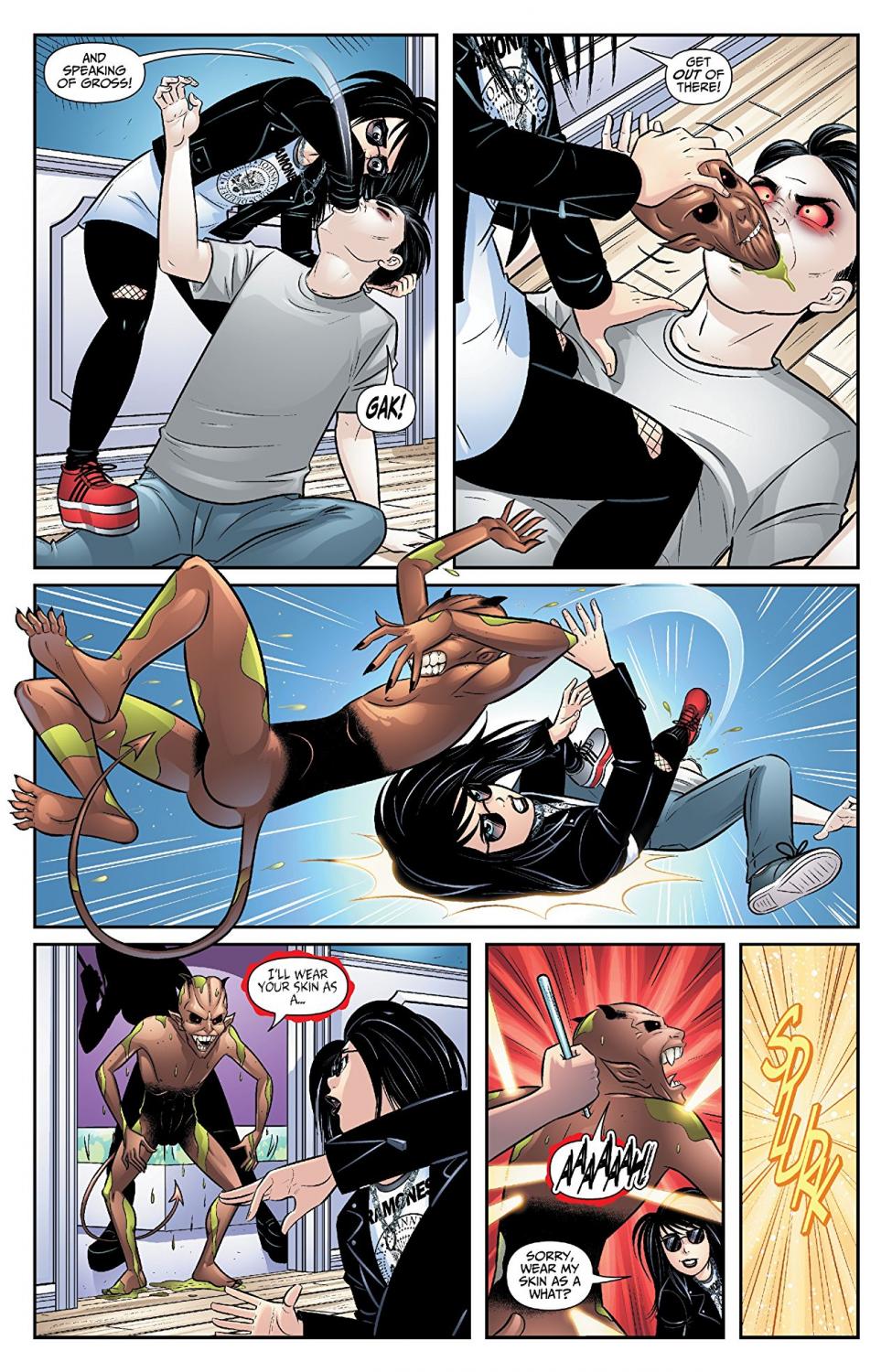
A Look Inside