Zero #1
Writer Ales Kot Artist Michael Walsh
Introduction
Writer Ales Kot has had his fair share of controversy lately over the current insanity of DC Comics. The writer does not seem to be the one at fault for leaving the company, after the more recent fallout due to editorial interference over at the house of Batman. Thankfully, the writer has taken on a new comic book series formally titled Zero. The comic book is from the amazing publisher fostering new talent known as Image Comics. It is refreshing to know that this is a medium that can publish just about any new comers without a bias. Many that are in dispute with the big two companies make a smooth transition over to the smaller press. The book features the protagonist known as Edward Zero who goes in and cleans the jobs that get messy. Each issue of the comic is set to have a unique artist and done in one storyline. Every installment of the title is set to encompass a different mission which can be told in any frame of time that the writer requires. Eventually the narrative will begin to piece these disparate plot threads together.
Writing
From the opening pages Zero makes a bold choice. The espionage like feel in the first pages immediately adds weight and sets the tone for the entire series. The use of a distant future creates an interesting sort of dark mirror like effect on the modern world. This is not a happy environment, but in a couple years what will our version of reality look like? These are some lofty philosophical questions being tackled by a comic book. Writing choices featuring new ways of expressing inner dialogue have some forward thinking narrative techniques. There is also a strange dichotomy between the bright art style and moody tone being set up that makes this tale fascinating. Touches of brutal violence sets the military setting apart from some of the other entries in the genre. There are is also a solid political angle being explored in the book. Cryptic teases are given towards why this installment of the narrative could be important to other chapters.
Art
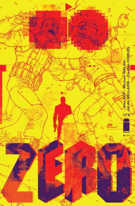
Michael Walsh serves readers some wonderfully dynamic pencils in the issue. The thick lines serve a nice style that feels as if things are in constant motion. In addition backgrounds are sparse, yet when provided they always add weight to the style. There are many unique stylistic choices inside of this issue that payoff very well for the creative team. Many interesting color choices are made, which sells a dramatic moment in the issue. There are some bold choices with lettering from Clayton Cowles that sticks out among some of the more tense scenes. The single splash page featuring the landscape of the setting is very interesting. Walsh does not draw buildings in the traditional sense. The design is entrancing throughout the issue itself. The cover has some bold covers that show off the immense talent of colorist Jordie Bellaire.
Conclusion
Zero is a strong and moody affair from Kot and Walsh. It will be enticing to come back next month and wonder who the next artist will be on the title. This is a solid first outing for the team.
Introduction
Writer Ales Kot has had his fair share of controversy lately over the current insanity of DC Comics. The writer does not seem to be the one at fault for leaving the company, after the more recent fallout due to editorial interference over at the house of Batman. Thankfully, the writer has taken on a new comic book series formally titled Zero. The comic book is from the amazing publisher fostering new talent known as Image Comics. It is refreshing to know that this is a medium that can publish just about any new comers without a bias. Many that are in dispute with the big two companies make a smooth transition over to the smaller press. The book features the protagonist known as Edward Zero who goes in and cleans the jobs that get messy. Each issue of the comic is set to have a unique artist and done in one storyline. Every installment of the title is set to encompass a different mission which can be told in any frame of time that the writer requires. Eventually the narrative will begin to piece these disparate plot threads together.
Writing
From the opening pages Zero makes a bold choice. The espionage like feel in the first pages immediately adds weight and sets the tone for the entire series. The use of a distant future creates an interesting sort of dark mirror like effect on the modern world. This is not a happy environment, but in a couple years what will our version of reality look like? These are some lofty philosophical questions being tackled by a comic book. Writing choices featuring new ways of expressing inner dialogue have some forward thinking narrative techniques. There is also a strange dichotomy between the bright art style and moody tone being set up that makes this tale fascinating. Touches of brutal violence sets the military setting apart from some of the other entries in the genre. There are is also a solid political angle being explored in the book. Cryptic teases are given towards why this installment of the narrative could be important to other chapters.
Art
Michael Walsh serves readers some wonderfully dynamic pencils in the issue. The thick lines serve a nice style that feels as if things are in constant motion. In addition backgrounds are sparse, yet when provided they always add weight to the style. There are many unique stylistic choices inside of this issue that payoff very well for the creative team. Many interesting color choices are made, which sells a dramatic moment in the issue. There are some bold choices with lettering from Clayton Cowles that sticks out among some of the more tense scenes. The single splash page featuring the landscape of the setting is very interesting. Walsh does not draw buildings in the traditional sense. The design is entrancing throughout the issue itself. The cover has some bold covers that show off the immense talent of colorist Jordie Bellaire.
Conclusion
Zero is a strong and moody affair from Kot and Walsh. It will be enticing to come back next month and wonder who the next artist will be on the title. This is a solid first outing for the team.
A Look Inside


