Youth #2 Review
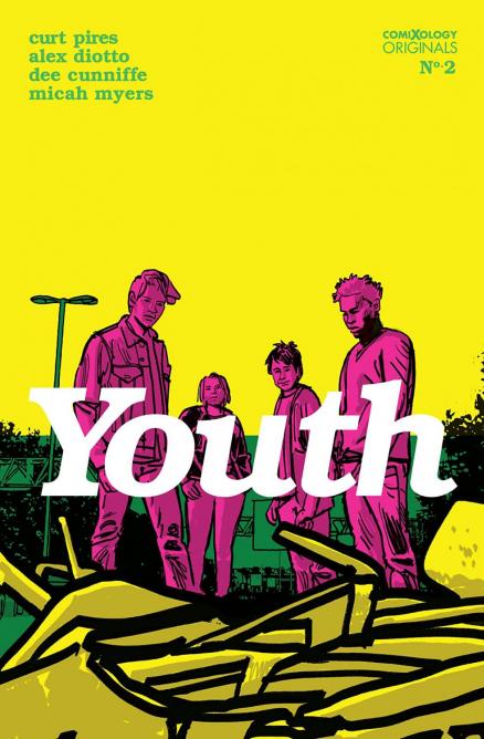
Written by: Curt Pires
Art by: Alex Diotto
Colors by: Dee Cunniffe
Lettered by: Micah Myers
Published by: ComiXology Originals
THIS IS A CALL TO ARMS TO LIVE AND LOVE AND SLEEP TOGETHER
WE COULD FLOOD THE STREETS WITH LOVE OR LIGHT OR HEAT, WHATEVER
LOCK THE PARENTS OUT, CUT A RUG, TWIST AND SHOUT
WAVE YOUR HANDS
MAKE IT RAIN
THE STARS WILL RISE AGAIN
THE YOUTH ARE STARTING TO CHANGE.
PLAY: THE YOUTH – MGMT
Following an absolutely incredible debut issue, Youth continues its majestically modern story of a couple of kids making their way through the weirdest part of life. The ending of the last issue turned what was a quiet and genuine tale of adolescent attitudes and angst into something even more special. How did it do that? It turned its characters into something even more special. With one crash of an object from space, our leads have been turned into beings of extraordinary abilities (isn’t it always the way).
This issue opens with a dialogue-less scene (at least no dialogue that makes explicit sense) that seems to give some information about what hit our characters. This sequence displays one of the best aspects of Curt Pires’ writing, and what this creative team does so well. In their comic for Image, Olympia, which I’ve reviewed (favorably), I have mentioned the cinematic qualities of the execution of that book. And this comic may do that even better than the former. It has the quiet (there’s that word again) simplicity of execution you find in art films and auteur cinema. That is now mixed with a touch of modern expression that feels genuine and captures the feeling of the modern youth (my self being one of them, I think I can speak on the subject). This is a shout out to the dyed hair, Frank Ocean listening, possibly drug-influenced youth culture of the present. Or at least the nostalgic zeitgeist we see ourselves as, like an Instagram filter around our imaginings of how we are that enhances the mundane reality of student loan debts and ignored Tinder matches.
But, I can say, this book captures that feeling in such a real way. It doesn’t have the watered-down feeling of a corporation or entity trying to cash in on the “coolness” of youth. It just feels like someone on the inside has crafted a story using the atmosphere of the culture; in short, it feels like 2020’s YOUTH (all caps). Added to that brilliant atmosphere is now a superpower/sci-fi twist. I love the vague beginning of this issue. Now it doesn’t feel like we’ll wait for an eventual backstory, it gives one without really giving one, and it leaves it open to possibly be brought back in the future. Now we get to just watch our characters react to their new abnormal. Even though “teens get powers” is a comic book staple like the three you get in the middle of a floppy, the reactions of these characters feel fresh. Maybe it’s because the aura and attitude of them have been fleshed out already and feel distinctly modern, or maybe it’s just how good Pires is at crafting a story. But, a lot of stories can feel familiar and fresh, but this one feels much more “fresh” than it does “familiar” and I applaud him for pulling that off. The end of this issue gives the book the ability to go many places, and with this writer and what he’s done already in the story, I’m ready to see what he has in store for the next 2 issues.
This is a comic that is so crisp in execution. The visuals pair with the writing perfectly. The simplistic and quiet nature I mentioned about the writing can be said about the art too. The pacing of the story has no fat and the visuals don’t either which adds to the cinematic feeling of the book. Like in Olympia, which has the same art team of Alex Diotto on art, colors by Dee Cunniffe, and letters by Micah Myers, Pires gives them a lot of room to shine. The efficient writing knows when visuals are best, as we see in the opening scene. Seemingly everyone gets a chance to shine during this sequence. The scene starts with just words, then the art shown is expressive. The swaying of the foliage, use of nature, and softer design of the “good” character are juxtaposed by the angular, skeletal, and more visceral seeming “bad” character. The colors are similarly expressive in that scene.
The designs of the story's main characters, although subtle, are also impressive. Maybe it’s in their subtlety that they flourish; they don’t feel overly “cool”. The art also does a good job of capturing motion, sometimes with the illustration of fabric or by drawing a scene so that it distinctly feels like the snapshot of a moment. The scenes of the group discovering their powers are colored with a nice dusk haze in the backgrounds. And, during Trixy’s big moment, the colors are used to affect the mood while the illustration of her face drives home her struggle. And, there's a terrific use of multiple panels. The pages following that showing the aftermath have some of my favorite art in the book.
YOUTH is a special comic. Its feeling is fresh because it couldn’t have been done any time in the past; it’s distinctly modern. It has a quiet beauty and a loud nature to it, like youth itself. It’s not a book about concepts or “plot”, its about atmosphere. Even though the events that happen are exciting and impactful, the intangible aura at its core is what makes the experience of reading it so satisfying.
A Look Inside


