Kill Whitey Donovan #2 Review
Written by: Sydney Duncan
Art & Colors by: Natalie Barahona
Lettered by: Troy Peteri
Published by: Dark Horse Comics
Kill Whitey Donovan is back with a vengeance. Anna and Hattie were closer to their goal than ever before, but a stray bullet may have just ended their journey before it really started.
The characters of Hattie and Anna are being written so well. The characteristics shown off in this issue make you want to root for them. They are being crafted with great believability and are shown to be very capable women. The story is doing a good job of showing their strengths while also putting them in unfortunate situations where they are understandably not in control. The general tension and unpredictability of this dynamic make it such an engaging read. The glimpses of their relationship shown in this issue keep with the unique dynamic from the opening issue where they aren’t best friends as much as they are necessary allies. The scene where Anna is patching up Hattie works well to establish one of Anna’s skills while also building on their relationship. It is one of many moments where this comic is able to achieve multiple goals in a single scene. It feels like while one scene is doing one thing there is another thing being set-up right behind it. That leads to the comic flowing in a really great way, just like the last issue. Writer Sydney Duncan has taken to this medium with such skill. The beats of this issue are similarly as great as in the first issue where it leads to a great cliffhanger, a formula that even seasoned comic book writers and long-running series seem to have a tough time doing in multiple issues. She seems to have the story planned so well and understands how to execute it to get the full effect in this medium making this a great comic book.
Hattie really steals this issue by showing she can size up situations in order to survive. The opening dream sequence was a great way of showing how she was educated, establishing more of the plantation backstory, and displaying an explicit situation that made it clear she will sometimes have to hide how intelligent she actually is; that opening exemplifies the “multiple purposes” flair to the writing. This all wraps around in Hattie’s scene with the Union soldier where we see her using what she learned in a well-executed moment that makes it clear she is in mortal danger. We also get another flashback that sets up the actions that follow it and delves into the origin of the scars we saw earlier in the issue. And, Anna also got chances to shine. Besides showing off her first aid skills, her calming of Hattie at the beginning and the fact that she was able to deceive the two Confederates while Hattie was unconscious shows her strengths. And, she was able to play “the role expected of her” perfectly. Perhaps because her mother, who was seen in a flashback in the previous issue, attempted to prep her for that exact role.
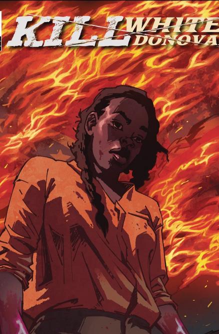
Natalie Barahona continues to impress me also with her art. The opening dream sequence immediately felt “off” with an ethereal nature helped a lot by the coloring. The symbolic quality, very appropriate for a dream, made for great visuals; The reflections of the flame in Hattie’s eyes, then her mother’s eyes going white and the chains ensnaring her from thin air as she appears to phase into a shadow made it clear that this wasn’t a flashback, or even a dream, but a nightmare. Then, Hattie awakens startled and mirroring her younger self. I love that the art is very expressive, which I also said in my previous review. When she awakes, the real world is illustrated with a nice palette, I like the greenery in the backgrounds. The facial expressions are another highlight of the art. When Hattie is fighting the Confederate we get some good expressions of struggle and anger on her face and some nice, slightly humorous, ones on his pig-like face. Their struggle has a nice fluidity to the action. Barahona's lines have a natural slant in the style she uses and when using it in action scenes that "slant" gives it a proper sense of movement. The last shot of that fight, with Hattie pointing the gun at the downed Confederate, has nice perspective.
That is another great detail of her art. There aren’t many “straight on” shots of characters, even in dialogue exchanges, she chose to frame and block her scenes differently and creatively making it interesting to read and never bland. It is seen in many, and basically every, shot throughout this issue. When the Confederate picks up Anna's letter, his face is obscured and the letter is focused on driving home the weight of the moment, then when he talks the shot is panned out almost like a crane shot by a camera and shows the distance between the two adding to the tension. Another time the creative framing adds wonderfully to a scene is when Hattie goes to get the water and is talking to herself. The shot is placed below her and the trees seem to be closing her in, it really points out the fact that she is alone in the woods, that then plays up to the suspense of what follows. The coloring in that scene and the coming storm is also a key factor in creating the mood of that great sequence. The “alone in the woods” scene features one of the two full-page shots of the issue, both are great. The panel layouts throughout are done well for showing detail and the changes in framing Barahona does with every panel, but I’d love to see more full-page shots like that one. I’d also love to see more chances taken with layouts just to see how she could impress me more. I use the word “expressive” to describe the art in this book because, reading a lot of comics, I see when another artist is just illustrating a story. Barahona makes every shot unique and doesn't settle for the minimum work which is the extra piece of magic in this series.
Kill Whitey Donovan has shown it is more than other comics in just two issues. It has a story that is unique and fascinating to see take shape, with strong and brilliantly fleshed out characters, and twists and turns in abundance. And, art that is in a style full of creativity on the same level of the writing and just as enjoyable to see move forward. While I feel, and believe, there are more good things in store for this comic, it is the unquestionable display of talent from the team that puts this over the top, and earns this review. This is one of my favorite series I’ve read in quite a while. I highly recommend it.
A Look Inside


