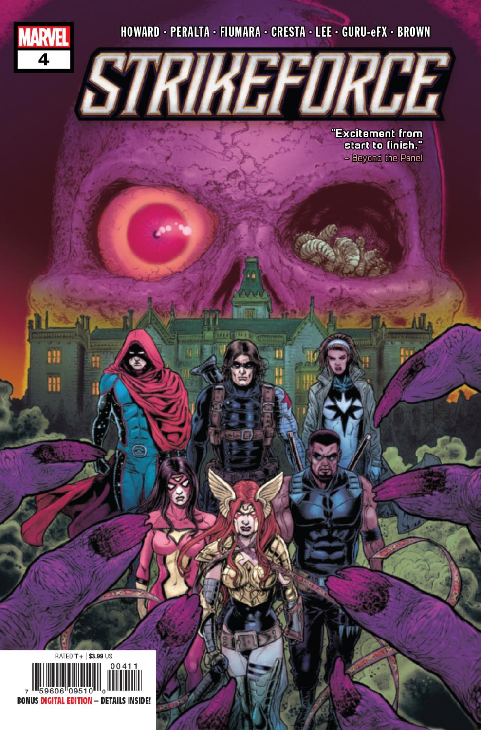
Strikeforce #4 Review
Written by: Tini Howard
Art by: Germán Peralta, Max Fiumara, Marika Cresta, & Stacey Lee
Colors by: Guru-eFX & Dan Brown
Lettered by: Joe Sabino
Published by: Marvel Comics
A halfling vampire, a princess, the former leader of The Avengers, a former sidekick, a single mother, a son of a witch, and the son of Satan walk into a mansion owned by a villain. This isn’t the beginning of a joke, it’s the beginning of this comic.
The format of this issue was fun. The titular team finds themselves taking refuge in one of Dr. Doom’s personal hideaways. After a few action-packed issues, the story, and the team, has deserved a break. While in the, somewhat spooky, manor, the team gets inspired to tell tales of their past. It starts to become clear that perhaps their history with the Vridai goes back further than they initially believed. Each story brings an entertaining look at a past encounter with the enemy (made all the better with the changes in artists). Although being interesting and informative looks into some of the characters’ pasts, the stories never seem to have a deeper personal meaning that I was expecting. That may just be my fault for trying to predict the narrative. However, when it is revealed what all the stories have in common it ties into the underlying story just in time for the end of the issue.
It loses me a bit at the end. After a quite cohesive issue of tale-telling, the cliffhanger takes away from the tone that had been building and brings into focus a perplexing development. Obviously, we’ll get the answers next issue and, when thought is put into it, the issue couldn’t have just ended without any hints to the future, but I still feel the development at the end dissolves the well-built tone of the issue. Although, that is just one page, the last one, so it is a pretty insignificant gripe and doesn’t lessen how enjoyable the rest of the issue was (which was very). Writer Tini Howard has continued to deliver on her promises about this series.With this issue, a horror tone has been more firmly established. Not just the environment and “campfire stories” element, but the use of mental attacks and infiltration of memories left a haunting feeling. And the warning at the end is definitely scary. Howard has also kept this story feeling distinctly “out of the box” for a Marvel team-up book; which is admirable. And her juggling of the characters has been neatly done. The humor in this book also deserves a shout-out.
Germán Peralta’s moody (in a good way) art has also been keeping this series feeling fresh. The detailed lines and great character illustrations have been a highlight since issue #1. Now with Guru-eFX on colors, the pair have been keeping the book looking good. In this issue, they’re aided by three guest artists and a guest colorist. Max Fiumara lends his art to the Winter Soldier’s flashback. He utilizes an inky style reminiscent of Jae Lee (hope he doesn’t mind the comparison) that adds grit to the WWII set story. There’s also a “wispy” nature to it that lends to the gung-ho young Bucky Barnes character. Marika Cresta takes over Daimon Hellstrom’s flashback. Speaking of art styles that add to characterization, this art not only features a retro Daimon design but uses expressions nicely to fully show his former attitude. There’s a really funny scene of Daimon watching on as Hellcat takes down the cultist goons. Finally, Stacey Lee handles Spider-Woman’s flashback. She perfectly captures a domestic tone with her modern feeling art. And her swirly, almost round, lines are perfect for Gerry Drew’s chubby toddler frame and curly hair. She also created the most adorably scary Vridai in the comic.
Dan Brown colors all three flashbacks and probably earns MVP of the issue. He matches Fiumara’s gritty style and the era with an appropriately understated palette. Then, with Cresta, channels a retro vibe with the bright outfits for Hellcat and Daimon. While also keeping New York City at night looking and feeling like New York City at night. His blending of colors in these two flashbacks are great. Especially the backgrounds in Bucky’s scene and the flames in Damion’s. The last flashback is where his versatility shines. Lee’s modern and domestic feeling art is colored in a way to highlight those traits. The shading done on Jessica and her son’s faces add to the wholesome feeling this scene has.
After finding its footing, this issue is a well-placed chapter in the series. With the last three installments being action-packed, this rest feels just in time. The focus on giving each character their chance to shine hasn’t changed. And, Tini Howard has crafted a story where that trend can be creatively continued. With the help of multiple great guest artists, this already engaging issue stays that way by changing its style to fit each new flashback.
A Look Inside