James Bond: Agent of Spectre #3 Review

“I’ve spent my life being used, a weapon to be pointed and fired...then discarded when its performance slips.”--James Bond
Christos Gage: Writer
Luca Casalanguida: Artist
Heather Moore: Colors
Simon Bowland: Letters
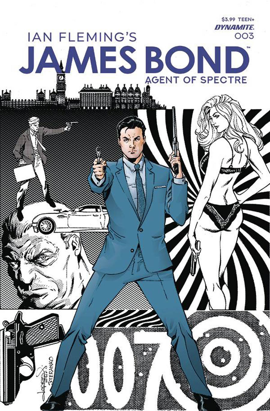
Aaron Lopresti: Cover
Matt Idelson: Editor
Dynamite: Publisher
Christos Gage and Luca Casalanguida are showing us James Bond at his absolute best in this thrill ride of a story. You do not want to be skipping out on this book!
Gage is telling this story as if it were destined to become the next part in the James Bond movie franchise. This story picks up where last month’s book left off with a major fight between Bond and his target Titania. Bond is a double agent but does he turn triple or quadruple by this point? Hard to keep up with all the twists and turns. And is Felix actually dead from the last issue? Only time will tell. Gage really understands James Bond and it shows in this comic. I feel like this Bond is a mixture of Timothy Dalton and Daniel Craig versions. A nice mix of suave and grittiness. This Bond certainly uses his wits and his abilities without all of the fancy gadgets that Bond is known for.
The art in this book is perfect James Bond. Luca Casalanguida has some serious pencil work here and it works perfectly. The pencils really have the feel of the written story that Gage is going with. Luca Casalanguida does an excellent job in adjusting his art style to fit the story. Casalanguida is also working on a book for another publisher (that is also incredible) and the the art style fits that story. That is the mark of a great comic artist. They adjust ever so slightly to drive the story forward.
The colors chosen by Heather Moore puts the cherry on top. The color palette that she has chosen is absolutely incredible. Very subtle tones that fit perfectly with the gritty story that is being told by the written word by Gage and the drawn word by Casalanguida. The opening pages of the book has the museum finale shots and the colors just pop against the grayish white of the museum. Especially the red dress that Titania is wearing. The colors just continue from there.
I also want to mention the cover for this issue. Every issue has had a different cover artist and this one is by Aaron Lopresti. The blue suit just pops right off that cover of the black and white inks with the rest of it that are absolutely sharp and perfect. I love how this cover pops.
This is a great series all in all. You don’t want to miss this one. Go ahead and pick it up.
A Look Inside