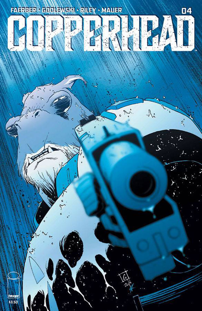
Copperhead #4

Something about cats and curiosity.
Writer: Jay Faerber
Artist: Scott Godlewski
Colorist: Ron Riley
Publisher: Image
Copperhead is a lot of things: Western, sci-fi, comedy, tragedy, mystery, action piece. Most importantly though, Copperhead is surprising and it continues to be surprising. Faerber, Godlewski and Riley, my new favorite creative team, show no signs of slowing down as we near what may be the end of Copperhead’s first arc. A lot has happened to Clara and Boo already and it’s quite obvious there’s a lot more to come as Clara sets out to find Ishmael after issue three’s devastating cliffhanger and Boo demonstrates his full physical prowess in a riveting chase sequence in this 4th issue.
Faerber is a careful, concise storyteller. His steering of Clara’s character is inspired. She transitions so easily from mother to tough police officer staring down the local “Boss Hogg” and back to accessible and gentle with Missus Sewell again. It truly seems as if this cast of characters already exists, thinks for themselves and has their own agenda and that Faerber is merely the translator of their tale, telling a story that already exists somewhere light years away. It’s that genuine and believable and it continues to be so as we learn more about this universe from the creation of the Arties to Boo’s backstory as a fighter in some distant war. Both Clara and Boo’s fates are up in the air by the end of this issue but I’m overwhelmingly confident that Faerber and these artists can deliver on a satisfying, strong and surprising continuation of this story come next issue.
Godlewski and Riley are firing on all cylinders for the most part again, too. Especially so, in that chase sequence. Boo’s backstory is forcefully brought to life in fitting juxtaposition with his current predicament, it’s a good, intriguing development that I’m looking forward to learning more about, showing instead of telling in the best ways possible. Clara’s physique is believable, Boo’s physical stature and prowess are displayed, the darkness on the edge of Copperhead is tapped into, and it’s a polished, sleek look into a layered complex world. The one thing, artistic choice or not I’m not sure, that really sticks out however, is the unfinished look of some of the coloring in this issue. There’s one dark page in particular, depicting Ishmael’s life in the wastes, has a weird, washed out effect on the purple liquids (Artie blood? Alien blood?) Similar in look and effect to watercolor marker streaks that didn’t dry at the same rate. It’s a small, inconsequential thing but it’s still a weird misstep I wouldn’t expect to see in a comic as polished as Copperhead is.
Copperhead is like a fresco, from far away, it's quite beautiful, breathtaking and resonant. Up close, you may notice some cracks that take away from the overall image. In the bigger picture, hose cracks are inconsequential even if they are noticeable. Copperhead is a lot of things and for the most part, all of those things are good. Really good. If you’re not on board yet, you need to be.
A Look Inside