Goners #2

Going, going, not gone but also not here yet.
Writer: Jacob Semahn (Co-Creator)
Artist: Jorge Corona (Co-Creator)
Publisher: Image
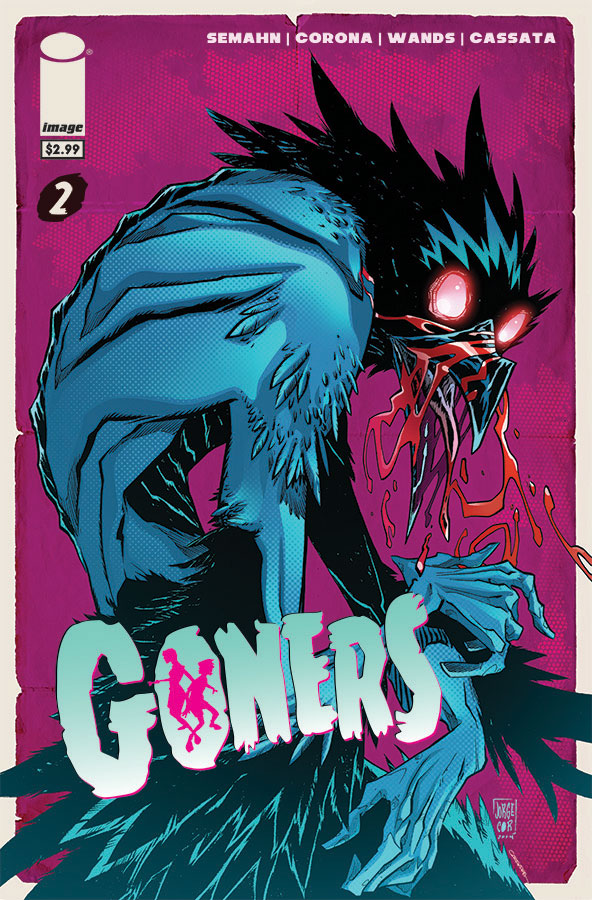
The cover is cool, really cool, but you won't be seeing that monster on the inside. The flashback segements are touching and add much needed context to the story, but few and far between. The art is vibrant, striking and lively but doesn't match the tone of the story. Goners, even into issue 2 is a mixed bag.
I normally try to avoid recapping plots blow by blow in these reviews because I think if you're here you've either read it, or you're going to and I'd rather spend my time on constructive or at least actual criticism. The problem with Goners 2. Really the only problem honestly, is that I can recap the whole plot of this issue in one sentence: The Latimer cast attempts to escape the police station from the end of the first issue. Aside from a very brief (albeit good, really good) flashback, that's the whole plot.
Semahn does a great job of creating this real, tense, tone. One that makes you fear for the Latimer family. Really fear for them. There's more here, too, as far as this family goes. The children, who I believe, who I hope are going to be the real leads of this story, are characterzied more. Which is good, because that was my biggest problem with the first issue. You understand them more, feel for them. Especially so, after that flashback of sorts. In the first issue I really disregarded the childish feeling of the whole issue, the mix of gore, horror and children wasn't working for me because it wasn't one or the other, it met somewhere in the shakey middle ground. Here, however, I embrace it. The brief dialogue and moments of real plot development do a great job of changing your perception of these kids and their protector. The problem is, again, there isn't enough of it. I just want more. I don't dislike what's here. I just want more of it. Elongating one scene across a whole book is an interesting experiment, one that might work later in a run, too. It doesn't work here. Simply so, because there's all these elments of intrigue, mystery and depth that are touched on and then completely abandoned. Readers who need to be really pulled into a book to like it won't find that here. Which is a real shame because this book has potential. Potential, in a PROOF or Sweet Tooth type way, a scary but readable story that touches on, and crosses a lot of genres. You can see a bit of it in the monster descprition on the last page, which I think was a simply inspired idea.
Corona's art is a step-up or at least a honing in from issue one in a surprising way, too. The childish tones are downplayed a bit, for the best I think, but he keeps the distinct style the first issue established. Like popular computer game, Torchlight, the colors are vibrant, explosive, full and entertaining and they compliment Cornoa's simplistic, bold style perfectly. There's an abudance of blood and gore throughout this issue and I think the gore itself is perfectly established, crossing genres and establishing a very specific tone. However, the blood has a weird effect to it, one that makes it look like it was slapped onto the pages as an afterthought, and there's too much of it layed over the top of the panels. It looks plasticy and detracts from the overall good tension and flow created by Cornoa and other's efforts.
This issue is a notch up from the first one without a doubt . A failed and successful experiment in ways, a book that feels too long and too short. However, I can see these creators settling into a real stride that may turn into a fun, bumpy, twisty and turny run.
Writer: Jacob Semahn (Co-Creator)
Artist: Jorge Corona (Co-Creator)
Publisher: Image
The cover is cool, really cool, but you won't be seeing that monster on the inside. The flashback segements are touching and add much needed context to the story, but few and far between. The art is vibrant, striking and lively but doesn't match the tone of the story. Goners, even into issue 2 is a mixed bag.
I normally try to avoid recapping plots blow by blow in these reviews because I think if you're here you've either read it, or you're going to and I'd rather spend my time on constructive or at least actual criticism. The problem with Goners 2. Really the only problem honestly, is that I can recap the whole plot of this issue in one sentence: The Latimer cast attempts to escape the police station from the end of the first issue. Aside from a very brief (albeit good, really good) flashback, that's the whole plot.
Semahn does a great job of creating this real, tense, tone. One that makes you fear for the Latimer family. Really fear for them. There's more here, too, as far as this family goes. The children, who I believe, who I hope are going to be the real leads of this story, are characterzied more. Which is good, because that was my biggest problem with the first issue. You understand them more, feel for them. Especially so, after that flashback of sorts. In the first issue I really disregarded the childish feeling of the whole issue, the mix of gore, horror and children wasn't working for me because it wasn't one or the other, it met somewhere in the shakey middle ground. Here, however, I embrace it. The brief dialogue and moments of real plot development do a great job of changing your perception of these kids and their protector. The problem is, again, there isn't enough of it. I just want more. I don't dislike what's here. I just want more of it. Elongating one scene across a whole book is an interesting experiment, one that might work later in a run, too. It doesn't work here. Simply so, because there's all these elments of intrigue, mystery and depth that are touched on and then completely abandoned. Readers who need to be really pulled into a book to like it won't find that here. Which is a real shame because this book has potential. Potential, in a PROOF or Sweet Tooth type way, a scary but readable story that touches on, and crosses a lot of genres. You can see a bit of it in the monster descprition on the last page, which I think was a simply inspired idea.
Corona's art is a step-up or at least a honing in from issue one in a surprising way, too. The childish tones are downplayed a bit, for the best I think, but he keeps the distinct style the first issue established. Like popular computer game, Torchlight, the colors are vibrant, explosive, full and entertaining and they compliment Cornoa's simplistic, bold style perfectly. There's an abudance of blood and gore throughout this issue and I think the gore itself is perfectly established, crossing genres and establishing a very specific tone. However, the blood has a weird effect to it, one that makes it look like it was slapped onto the pages as an afterthought, and there's too much of it layed over the top of the panels. It looks plasticy and detracts from the overall good tension and flow created by Cornoa and other's efforts.
This issue is a notch up from the first one without a doubt . A failed and successful experiment in ways, a book that feels too long and too short. However, I can see these creators settling into a real stride that may turn into a fun, bumpy, twisty and turny run.
A Look Inside