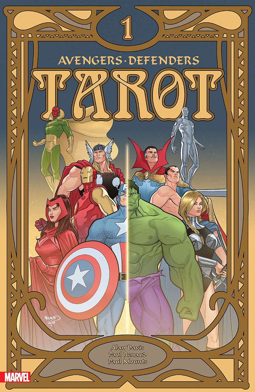
Tarot #1 Review

Writer: Alan Davis
Artist: Paul Renaud
Colourist: Paul Mounts
Letterer: Clayton Cowles
Publisher: Marvel Comics
Everything about Tarot #1, from the cover to the marketing bumf, suggests I'm in for a wild ride before I even open the book. So I shouldn't be so surprised to find the first scene surprising, but I do.
The good surprise: The comic's super-team lineup is even bigger than I expected, because it kicks off with an Invaders fight in the middle of WW II.
Cap, Namor, and the OG Human Torch battling a Nazi sorcerer with the power to animate statues! That rubs my zeal for the Silver Age in a very good way.
But there's also the bad surprise: Alan Davis's dialogue hits me like a chilly winter wind. It's clipped and beige. It moves the story forward but keeps its characterization cards shockingly close to its chest.
This eases up a little as Namor's memories carry the story into the present day and the Defenders -- after helping Dr. Strange defeat another sorcerer -- link up with the Avengers.
Team interactions do eventually let some personality shine through. The Hulk, in his classic Defenders mode of "good-hearted but impatient dimwit," gets the majority of the issue's character work. But Thor gets a little slice as well, bamboozling the Hulk with some kindly reverse psychology as they clear wreckage at Avengers Mansion.
Paul Renaud's art is a delight throughout. He has a smooth mastery of the characters and complete comfort with retro costumes. He takes some stylistic cues from Alan Davis's own art, but he's even more sensitive to the specific needs of Mr. Davis's script.
Mr. Davis is a big believer in the power of visual storytelling, and Mr. Renaud does not disappoint when the words fade out and entrust the story entirely to his art. He assembles his panels with a scrupulous flow from moment-to-moment, seamlessly carrying the reader through thrilling fight scenes.
Paul Mounts helps things along with a subtle colouring job that puts a modern spin on the retro story. Yes, at points, he blazes along with primary colours and simple shading. But he also uses the palette to fine-tune moods in ways that wouldn't have been possible in the four-colour days. The Defenders' night-time arrival at Avengers Mansion, for instance, is very blue. Mr. Mounts achieves the effect not through a simple overlay, though; he completely overhauls the palette to reflect low-light conditions and build an all-new, still-harmonious range of colours.
I have to return to the script because I don't want to leave the impression that I'm wholly dissatisfied with Mr. Davis's work. While the dialogue strikes me as chilly, the plot comes together like a luxuriously-crafted Swiss watch.
This initial issue sets up at least two compelling plotlines: Namor's time-twisted occult experiences with the Invaders and Defenders, and the Silver-Age magical baddy gunning for the Avengers. Both are already individually compelling, and I have no doubt their future interactions will deliver some fascinating developments.
Tarot #1 scores a lot more points on art and plot than on characterization. This twisty occult mystery would be a good issue-to-issue read for those who like lots of leeway to do their own character interpretation. That's a perfectly valid way to approach comics, and such readers should pop a bonus point onto my rating. Those who prefer a more contemporary, author-directed style of characterization can probably wait and check out Tarot when it arrives in trade paperback or Marvel Unlimited form.
A Look Inside


Comments