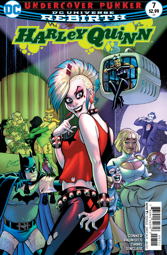
Harley Quinn #7

Harley Quinn #7
Written by: Amanda Conner and Jimmy Palmiotti
Art by: John Timms
Colors by: Alex Sinclair and Hi-Fi
Part 3 of “Undercover Punker” sets Harley smack dab in the middle of a superhero/supervillain fetish club! And in the middle of all the debauchery, she’s stuck with members of Purple Satin, a band of punk rock criminals bent on stealing from NYC delivery trucks! Separated from the rest of her band, Harley follows the members of Purple Satin to their base of operations where she finally meets the mastermind behind the crimes…
Ever since issue #1, Harley Quinn has been eccentric, electric, and totally over the top. A common trend in post-Rebirth DC is that every line needs to be simultaneously smart and emotionally impactful. Just like the titular character herself, Harley Quinn turns that all upside down, throws it out the window and yells: “Just let me have fun!”
Harley Quinn #7 is one of those issues where the humor effortlessly permeates the pages, and where Harley’s infectious attitude and awesome supporting cast gives the book a simple charm that makes other try-hard “funny” comics look bad just because it’s so easy here. Standout moments include the fate of Pizza Delivery Guy from issue #5, and an epic whiskey drink-off for the ages. Of course, it’s not a Harley issue without some toilet humor involved. You can rest easy knowing there’re a couple scenes that might be even more over the top than the pet poop scene from the previous issue…
Harley might not be as deep or thought-provoking as Batman or Superman (and it shouldn’t be), but Harley Quinn #7 does a good job grounding the protagonist by taking a quick look back at her time with Joker. Rebirth has been all about reexamining a character’s roots, and we seem to be getting a little taste of that by the end of this issue.
Harley Quinn #7 also continues the line’s tradition of continually showcasing some of the best artwork week after week, done by on-and-off Harley artist John Timms, with Alex Sinclair and Hi-Fi on colors. It’s rare when artwork in a comic feels genuinely kinetic and even rarer when, at its very best, the art can be almost synesthetic. Going through the issue, you can almost feel the bass pumping in the underground club, starting off strong and chaotic, and dimming into the background as the gang goes into the back room. Some of my favorite effects include the beautiful Van Gogh-esque lights scatted throughout the pages and the brilliant blue lighting in the water tanks and computer monitors.
Harley Quinn has consistently proven to be one of the most outrageous, funniest, and colorful comics in DC’s current lineup. Just like her crazy blue and pink hair and her never-say-never attitude, Harley #7 shows us just how vibrant and fun a crazy clown girl can be when she’s backed up by a cast of lovable outcasts, lookalikes, and egg-shaped sidekicks.
A Look Inside