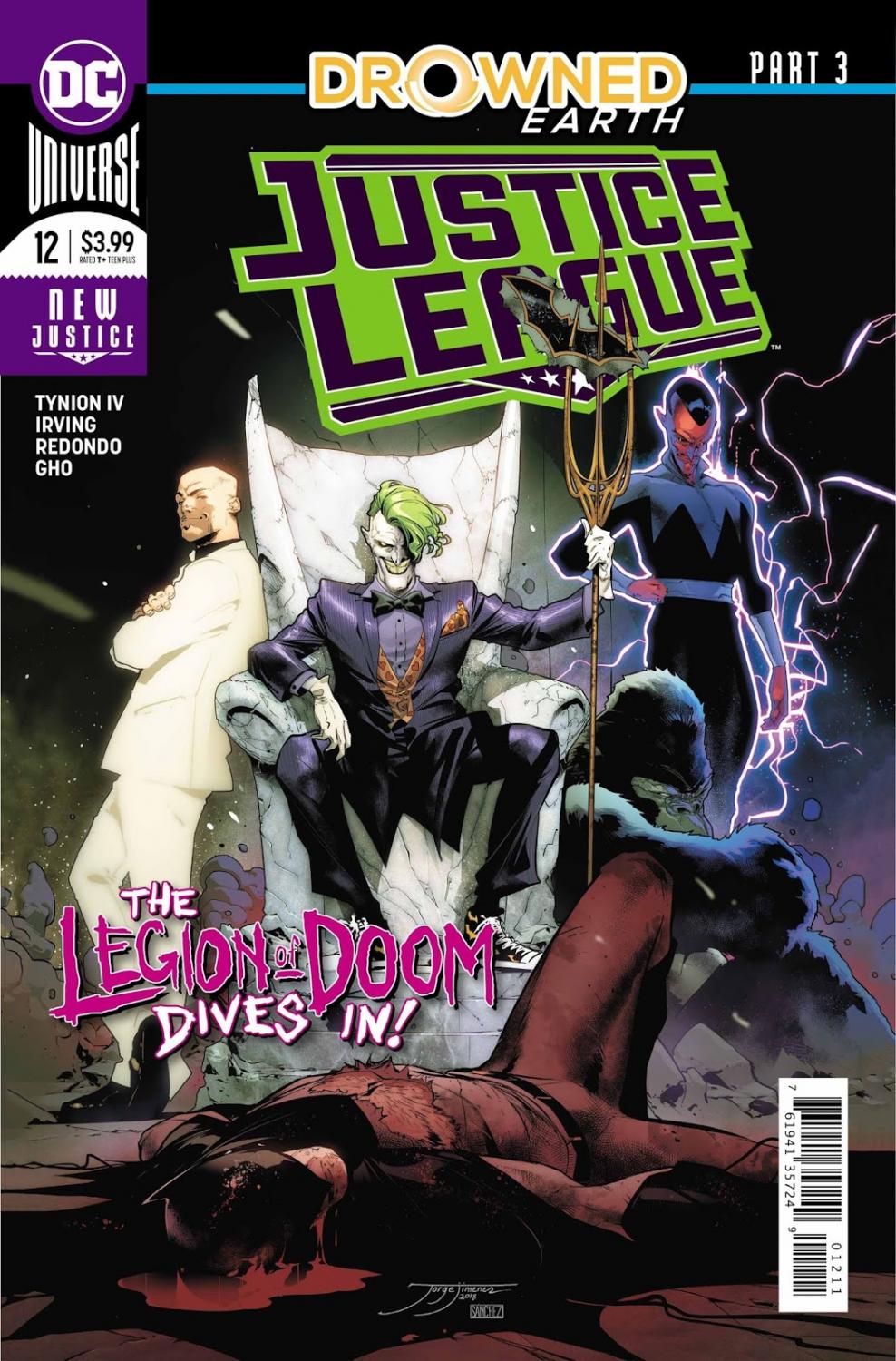
Justice League #12 Review
Writer: James Tynion IV
Artists: Frazer Irving and Bruno Redondo
Colourists: Frazer Irving and Sunny Gho
Letterer: Tom Napolitano
I don't really have a plan on how to tackle discussing this issue. I guess the first thing I can talk about is that the solicit for this issue promised one thing, which was seeing a handicapped Batman take on the Legion of Doom. For starters, this is an almost entirely off-panel action scene that we obviously don’t get to see. With this it's also obvious that some things were changed since this issue was first solicited, and that's fine. There's nothing wrong with a bit of story reworking if necessary. What bothers me is that instead of an interesting and never-before-seen beat in the story, this is almost entirely a narration and exposition dump, which really doesn't interest me, particularly because I don't care about the story.
First things first: we have two interesting artists on this issue. First is Frazer Irving, whose artwork I have a complicated relationship with. For the most part I'm of the opinion that it isn't necessarily for me, but there are some solid pages here where he clearly flexed his style to make the pages seem a bit more traditional. He's colouring his own stuff so he has this Francis Manapul-esque presence in this issue which may be what DC were going for in the first place. Bruno Redondo is the second artist, and he's great. He's been a mainstay on the INJUSTICE books for a long time. I actually haven't read any of those, but his work here was fantastic and I'd love for him to do more in-continuity DC work. I like his take on the characters, particularly Batman, and I was overall pleased with this issue from an artistic point of view.
My gripes are with the story. James Tynion IV has actually been doing the work of his career with his run on this title along with Scott Snyder. So why don’t I like it, then? It's a bit more complicated. I felt incredibly passive while reading this issue and yet I felt completely exhausted after reading it, in a bad way. The writing and the dialogue itself is fine, though it can be clunky at times. This issue is just paced so badly that I'm extremely bored while reading the exposition dumps, and I have to go back and really focus on what just happened. This issue, and this has been a problem with this entire run, is so wordy and artistically inconsistent that I can't help but sometimes just bounce from word balloon to word balloon to get through the issue faster. I get that I'm not exactly narrowing down on what didn't work for me in this issue but, frankly, it's hard. It's hard because I don't even know what's happening in this story. There are Tears and Keys which are just basic, boring MacGuffins to me that don't add any stakes or intrigue into the story. Quite simply, there isn't much separating this from a generic blockbuster story.
My thoughts on this issue are complicated but not nearly as wordy and bloated as this issue is. It's gorgeous and the two artists that worked on this should be damn proud of their good work, along with the colouring and lettering work done by Sunny Gho and Tom Napolitano, but this issue bored me on such a fundamental level that I truly can't even describe it.
A Look Inside