Aquaman #34 Review
Writer: Dan Abnett
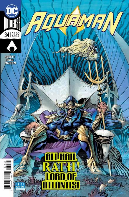
Artist: Kelley Jones
Colourist: Michelle Madsen
Letterer: Steve Wands
Whatever momentum this series had is now long gone. This arc has been going on since June of last year, and it looks like we're no closer to the end. According to this June's solicits, it looks like this arc might extend until July, making it a full thirteen or more issues of a snail's pace story. I just don't see why this series can't be exciting and fun.
Dan Abnett decides to spend some time focusing on King Rath, the villain of the story who set up the Crown of Thorns in the first place. He delves into the character, highlighting his troubled relationship with his father as well as Kadaver, the villain who's been a thorn in Aquaman's side earlier in the story. I don't think Abnett is entirely successful with this focusing on Rath's past, as I personally don't feel much sympathy for him. The implication that he's making up trying to impress his long-dead father is really contrived and just doesn't jive well with the character we're getting. His motivations could have worked if they were simpler; Rath could just be a bad guy trying to take advantage of the system.
Kelley Jones handles the art duties here, and I have to say the art was very strong for me. I'm not always a fan of Jones; his proportions can be a bit off and sometimes his artwork simply looks excessive in every sense of the word. Here it feels more nuanced, especially since Jones plays with shadows which makes it more exciting to look at. Maybe I'm impressed with it because it's the most traditional-looking art this book has had since last June, which I think is the reason.
I've complained about the lettering of this book a few times in the past and Steve Wands overall isn't really doing a good job for me. I take issue with the thought boxes he comes up with to display Rath's inner monologue. It has an odd colour scheme, which is blue but slowly transitions to white at the bottom. What bothers me is that the lettering is also white, making it hard to read sometimes. I don't know much about lettering but I feel like Wands has broken a few basic lettering rules in this series, multiple times. It's frustrating when a book I'm not a fan of also has subpar lettering.
This is yet another mediocre issue. Abnett chooses to investigate the character of Rath but I think he comes up short and doesn't provide anything interesting. If you haven't dropped this yet, please do. It's a waste of your time and money if you're seeing things right.
A Look Inside


