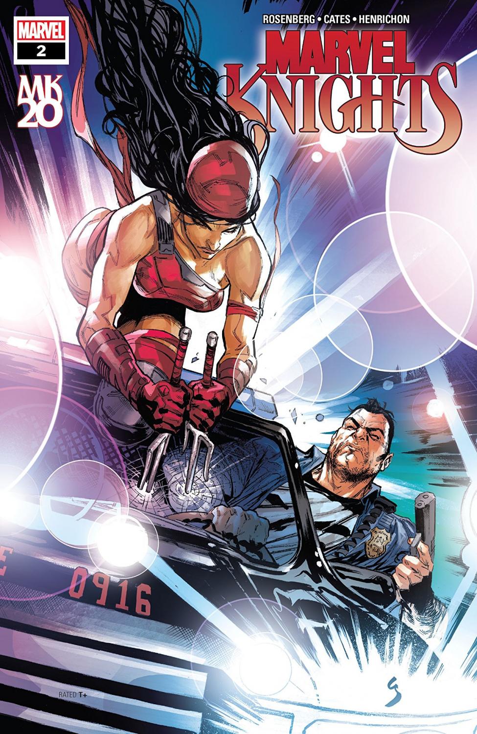
Marvel Knights 20th #2 Review
Story: Matthew Rosenberg & Donny Cates
Script: Matthew Rosenberg
Artist: Niko Henrichon
Publisher: Marvel Comics
The introduction to Donny Cates and co.’s Marvel Knights didn’t quite do it for me, but mysteries often take a little longer to really pull me in. I was certainly interested in seeing where the story goes, but unfortunately this issue isn’t doing anything to keep me around.
Much of the time in this chapter is spent showing us just how Bruce and Frank started working together to figure out what’s happened to them, and the problem is that it plays out exactly as you would think. Because of this, it just doesn’t feel like there are many “new” developments. When something new is happening (like Frank confronting Elektra), it feels drawn out. The issue could have seriously benefited from some editing to trim the fat. If you’re like me and the first issue didn’t click for you, then you’ll almost certainly like this one less. The dialogue can feel a little clunky, too. Characters get kind of heated right away instead of slowly building to the reaction like a real person would.
Niko Henrichon is covering all art duties in this issue, and I regret to say that I think it’s a small step back from the previous. Henrchon’s body language doesn’t do as much to carry conversations, and it can even detract from the moment in some cases. The fight between Elektra and Frank that goes on way too long is also just hard to follow, so it’s hard to enjoy that spectacle of it instead. The coloring is my favorite part of the visuals, though. Clearly a lot of effort was put into blending tones in a cohesive way, and it truly pays off in the close up panels. Shadows on Daredevil also just up his cool factor by a thousand in a big moment reminiscent of his debut in the Defenders on Netflix.
Marvel Knights 20th is a pass for me so far. It’s apparently out of continuity and frankly just not doing enough—fast enough—to hold my interest. An overall clunky script that isn’t done any favors by the pencils, can only be improved so much by solid coloring. If you were on the fence after last issue like me, skip this one.
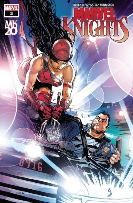
A Look Inside