Batgirl #1

Writer: Hope Larson
Artist: Rafael Albuquerque
Colors: Dave McCaig
Letters: Deron Bennett
Publisher: DC Comics
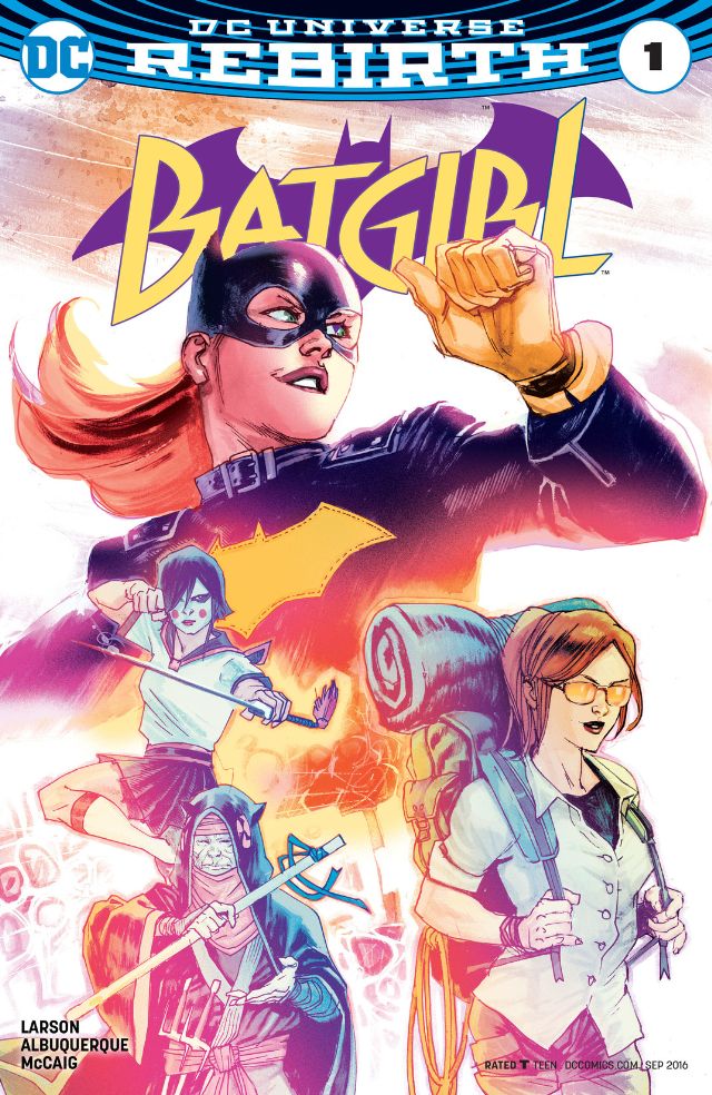
In Batgirl #1, Barbara Gordon travels to Japan to interview the Fruit Bat, a legendary Japanese vigilante. There, she runs into a childhood friend who is traveling across Asia. While meeting the Fruit Bat, they are attacked by a villain and Batgirl and the Fruit Bat team up to beat her. The introduction of the villain feels like an afterthought, but seeing the Fruit Bat in action is fantastic. The action doesn't obfuscate the rest of the book, Larson captures a breezy mood, which is perfectly complimented by the art. The book has a sense of humour to it, and while not every quip lands, it is refreshing to read a superhero story that's not entirely self-serious.
Most of the Rebirth books have had really unconventional paneling (to their detriment), whether it is bizarre layouts (the glass of beer on the first page of Detective Comics #936) or books being too busy (this week's Nightwing). And while Batgirl shares a similar approach with those titles, here it's executed in a flawless manner. Albuquerque uses negative space and smart designs to make the book a very pleasing read. and McCaig's use of pastel colors to highlight the background of selected shots is a fantastic choice.
Albuquerque's brilliant paneling highlight movement. From the first page, the simplified backgrounds on borderless panels allow him emphasize the book's action with his lines. With detailed backgrounds appearing only on a handful of pages, the first half of the book is very focused on facial expressions with a lot of close-ups. While it isn't a visually stunning as the action scenes, Albuquerque does a decent job with them, highlighting the book's humour with a wide range of expressions.
With the issues taking place in Okinawa, Deron Bennett's lettering highlights the use of Japanese with a pink font. New Super-Man used a similar technique to differentiate English from Mandarin, but the font used for English w as a strong blue, which really stood out even though it was used very sparingly. Here, the font does clash a little with the first half of the issue at first but it blends in perfectly as brighter colors and negative space are used more heavily in the later half of the book.
In the midst of all the controversy around Barbara Gordon, it is really refreshing to read a book this good with a lighter tone. The art and coloring are outstanding, while the writing plants the seeds for what promises to be a unique run. This is another Rebirth comic that I'll be adding to my pull list.
A Look Inside