Tony Stark: Iron Man #12 Review

Writer: Gail Simone
Artist: Paolo Villanelli
Colourist: Edgar Delgado
Letterer: Joe Caramagna
Publisher: Marvel Comics
A new creative team slides behind the wheel to drive Tony Stark through the War of the Realms. My analogy is not great because Tony is mainly reactive in this initial issue; so far, the creators are actually driving the War to him. But this does not hurt the reading experience and TSIM #12 lands as a quality comic.
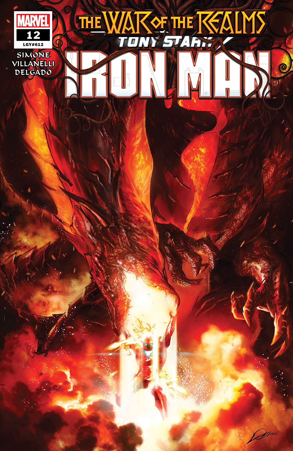
Malekith delegates the job of fighting Iron Man to a dragon from Jotunheim. Iron and elves don't mix - and never mind that Tony's suits have been made out of sci-fi nonsensium rather than iron for decades now. The important thing is setting up a quality Iron Man vs. a Dragon fight.
How are things shaping up on the other side of the ring? The creators ease us into Tony's world with a light comedy scene. He's developing an "emotional Fitbit" gizmo for the Hulk, and Rhodey is there to point out some of the zillions of flaws that make this a Bad Idea.
Gail Simone's script employs Rhodey like a scalpel, slicing through the Stark charm to expose the fragility inside. For all his talk about the Hulk, Tony's obviously thinking about using the gizmo himself. And that is just soaking in Bad Idea potential: "I'm worried that my good friend, who is an alcoholic in recovery, is holding a magic behavior modifier … and won't set it down."
And the gizmo, of course, takes the shape of a crown. That ties straight into the dragon story's high fantasy premise. It goes without saying that when Sadurang, the dragon, rolls up on Stark Unlimited and starts the ruckus, he's shouting about tearing down "Lord Stark's stronghold."
This is just the first act in the story, but so far it's striking a perfect balance between a rip-roaring fantasy fight and an insightful exploration of Tony's character.
It's brought to life with excellent visuals. Artist Paolo Villanelli slides smoothly into the title's established style. He constructs the same sort of densely-layered pages as regular artist Valerio Schiti and sticks with the same overall design language. He brings a rougher, more organic feel to finishing off the characters, though; the faces in particular (especially Tony's) have a confident sketchiness. It already works well, and I think it'll work even better as the fight rolls on and everybody gets more battered.
Colourist Edgar Delgado maintains the title's usual high-intensity palette and brings a couple of laudable tricks to the table. First, he and Mr. Villanelli conspire to make the fight scenes excitingly chaotic without making them confusing. And even more impressively, Mr. Delgado treats Sadurang to an issue-long colour evolution. The dragon gets redder and redder over time. It's a terrific touch that feeds into the story's rising sense of danger.
Turning Tony Stark over to fresh creators for his big War of the Realms tie-in looks like an entirely good idea so far. Gail Simone and Paolo Villanelli both employ an additive approach, demonstrating a mastery of the title's existing strengths before unleashing their own distinctive spins. This arc looks primed to live up to what's come before - and pushing the title's quality bar to new heights is a distinct possibility for the following issues.
Artist: Paolo Villanelli
Colourist: Edgar Delgado
Letterer: Joe Caramagna
Publisher: Marvel Comics
A new creative team slides behind the wheel to drive Tony Stark through the War of the Realms. My analogy is not great because Tony is mainly reactive in this initial issue; so far, the creators are actually driving the War to him. But this does not hurt the reading experience and TSIM #12 lands as a quality comic.
Malekith delegates the job of fighting Iron Man to a dragon from Jotunheim. Iron and elves don't mix - and never mind that Tony's suits have been made out of sci-fi nonsensium rather than iron for decades now. The important thing is setting up a quality Iron Man vs. a Dragon fight.
How are things shaping up on the other side of the ring? The creators ease us into Tony's world with a light comedy scene. He's developing an "emotional Fitbit" gizmo for the Hulk, and Rhodey is there to point out some of the zillions of flaws that make this a Bad Idea.
Gail Simone's script employs Rhodey like a scalpel, slicing through the Stark charm to expose the fragility inside. For all his talk about the Hulk, Tony's obviously thinking about using the gizmo himself. And that is just soaking in Bad Idea potential: "I'm worried that my good friend, who is an alcoholic in recovery, is holding a magic behavior modifier … and won't set it down."
And the gizmo, of course, takes the shape of a crown. That ties straight into the dragon story's high fantasy premise. It goes without saying that when Sadurang, the dragon, rolls up on Stark Unlimited and starts the ruckus, he's shouting about tearing down "Lord Stark's stronghold."
This is just the first act in the story, but so far it's striking a perfect balance between a rip-roaring fantasy fight and an insightful exploration of Tony's character.
It's brought to life with excellent visuals. Artist Paolo Villanelli slides smoothly into the title's established style. He constructs the same sort of densely-layered pages as regular artist Valerio Schiti and sticks with the same overall design language. He brings a rougher, more organic feel to finishing off the characters, though; the faces in particular (especially Tony's) have a confident sketchiness. It already works well, and I think it'll work even better as the fight rolls on and everybody gets more battered.
Colourist Edgar Delgado maintains the title's usual high-intensity palette and brings a couple of laudable tricks to the table. First, he and Mr. Villanelli conspire to make the fight scenes excitingly chaotic without making them confusing. And even more impressively, Mr. Delgado treats Sadurang to an issue-long colour evolution. The dragon gets redder and redder over time. It's a terrific touch that feeds into the story's rising sense of danger.
Turning Tony Stark over to fresh creators for his big War of the Realms tie-in looks like an entirely good idea so far. Gail Simone and Paolo Villanelli both employ an additive approach, demonstrating a mastery of the title's existing strengths before unleashing their own distinctive spins. This arc looks primed to live up to what's come before - and pushing the title's quality bar to new heights is a distinct possibility for the following issues.
A Look Inside


Comments